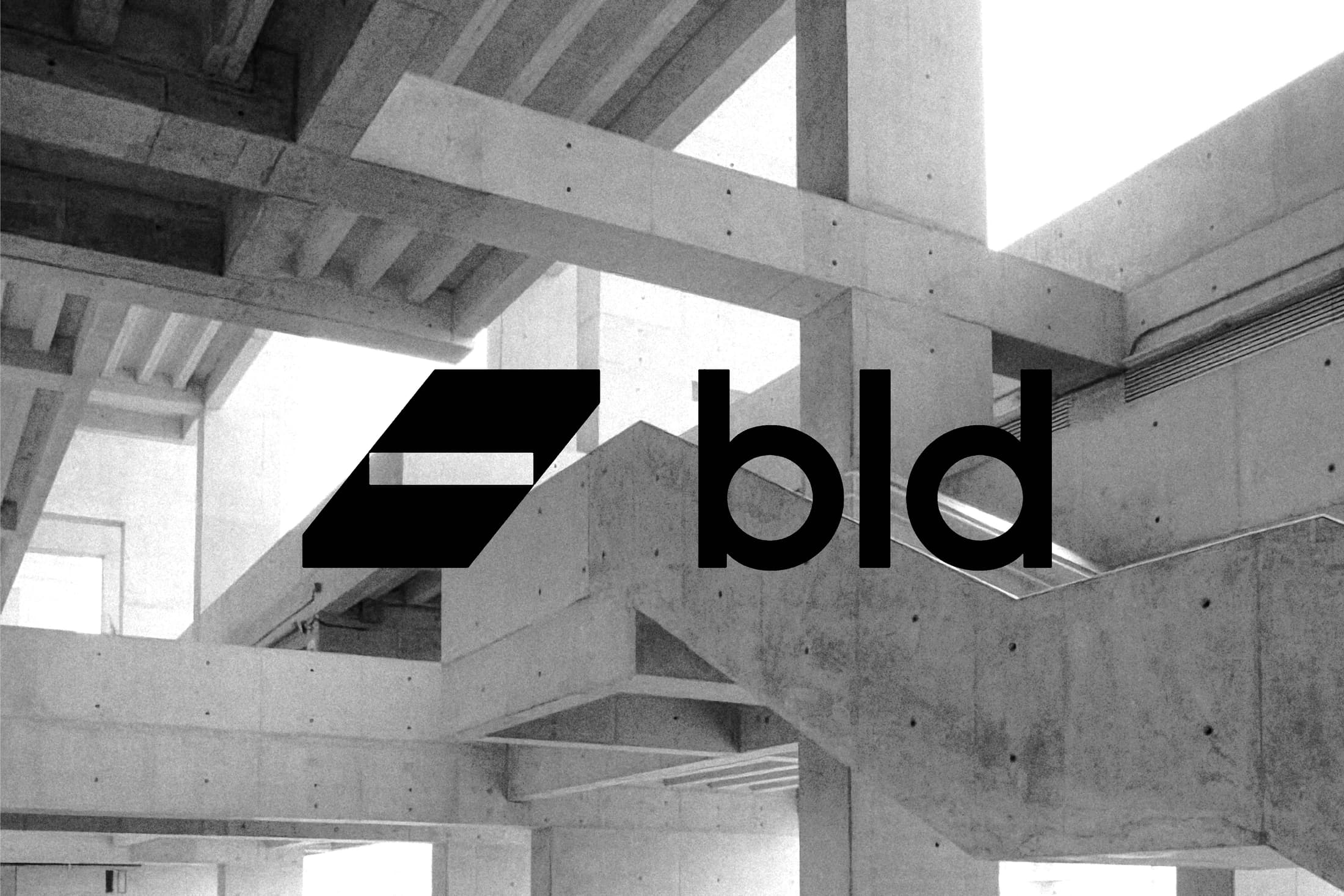
BLD combines an angular, ribbon-like emblem with a simple lowercase wordmark. The geometric symbol introduces a sense of structure alongside the softer curves of the lettering.
A monochrome presentation over architectural photography tests the mark against a concrete setting, followed by a white-on-black version that isolates its silhouette. The work is presented as an identity study. Both versions keep the emblem separate from the lettering, allowing the relationship between the two forms to remain clear against different backgrounds.