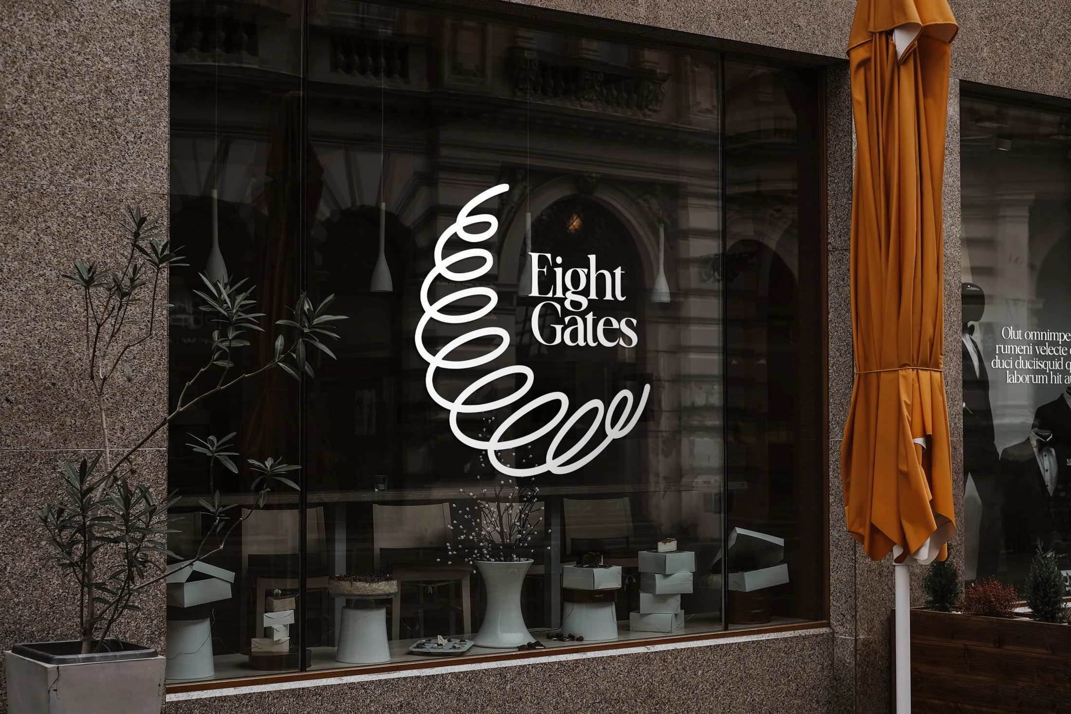
Eight Gates takes a minimal yet homey brief and gives it an expressive central gesture. A continuous looping emblem sits beside a compact wordmark, balancing a recognisable silhouette with a quieter typographic voice.
The window-branding mockup tests the identity at a larger scale, where the white mark remains clear against the detail of an interior. The identity gives the brand enough character to feel personal while leaving room for the candles, stationery and considered everyday objects that sit at the heart of its offer.