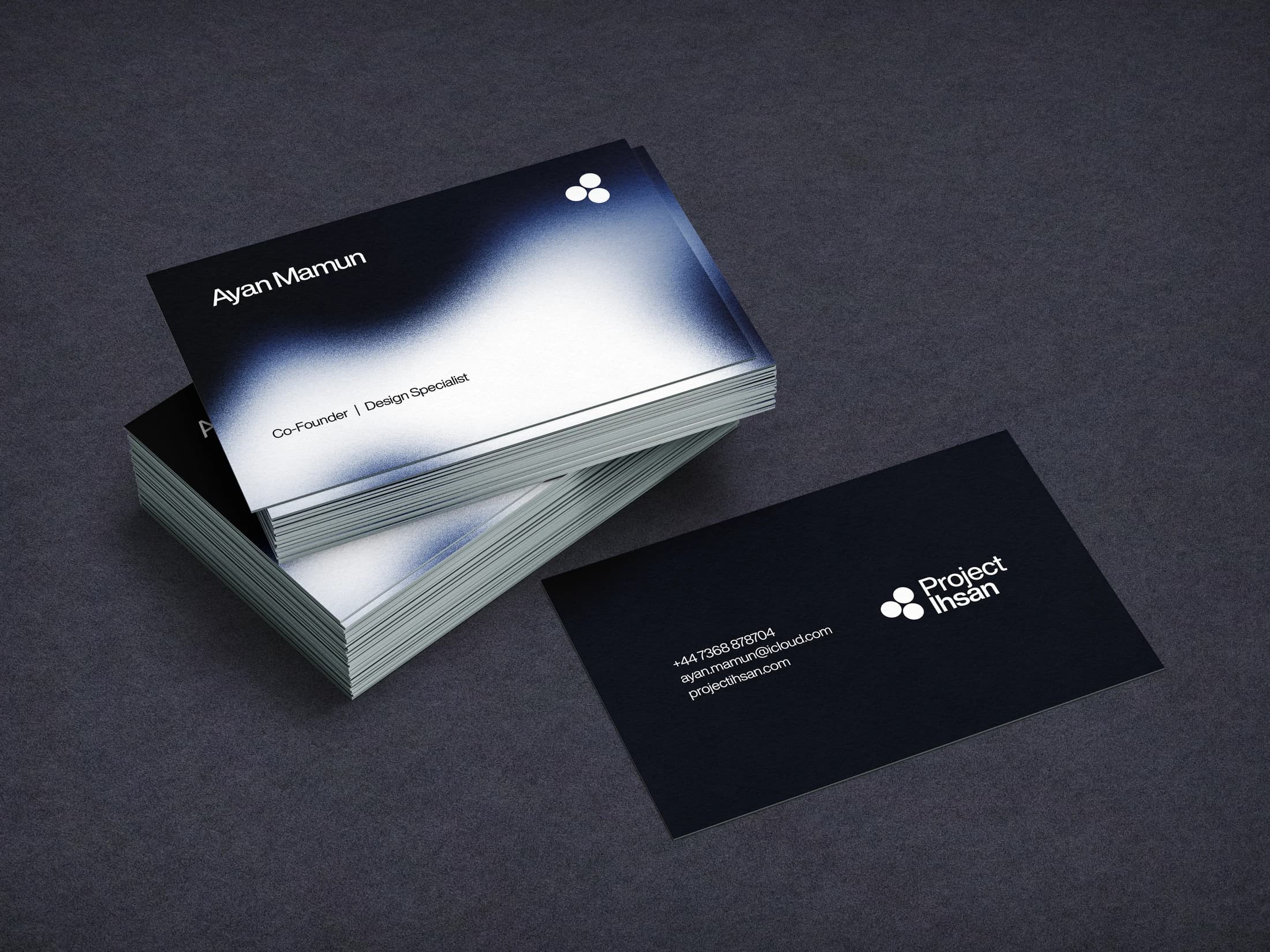
Project Ihsan uses a small clustered emblem as the stable element within a softer visual environment. Deep blue grounds and diffused areas of white light give the stationery a sense of depth, while the compact wordmark keeps the information precise.
The selected mockups show how those elements carry across individual business cards and a wider arrangement of printed pieces. A clear division between expressive surfaces and quieter information panels allows the system to accommodate both recognition and practical reading. The case study concentrates on the identity’s visual language and the consistency of its applications, with the stationery mockups providing the main evidence of the design direction.